
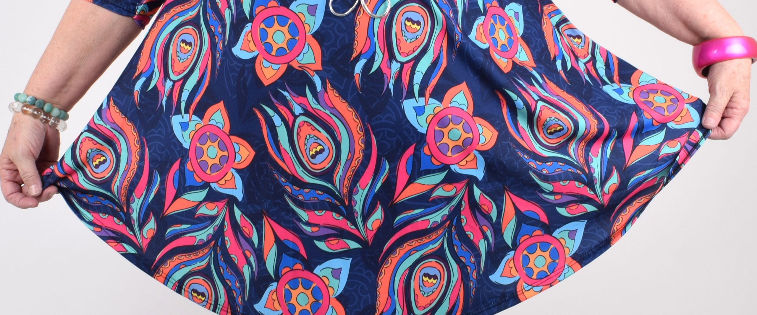
Everyone sees color differently – a color can make one person happy and make another one feel straight out awful. Colors are an optical phenomena that has a deeper unconscious impact on our feelings and how we perceive things, than we might realize. I have always loved color and dressed accordingly my whole life. Without colors I feel impersonal, like unseasoned food. I need color around me!
The colors that affect us the most are red, yellow, green and blue. Their nuances set a certain mood and evokes different emotions. Culture, upbringing and personal values are all aspects that affect how a person perceives color. I will tell you a little about how colors affect our mood and well-being and what role color plays in our society. Color can be very helpful in many situations.

GREEN – the color of plants and nature
How the color is perceived and how it affects you:
- Calms and eases stress (counteracts depression)
- Pleasant and cozy
- Helps you concentrate
- Stabile, independent, nurturing and safe
- Green is associated with something healthy and fresh
- Dark green is often used in logos of banks
- Green calms visitors in many public spaces
Good tip!
Green gives a nice contrast to all other colors. Try combining it with red and orange! Houseplants makes the home and workspace more pleasant.

BLUE – a sympathetic color that sparks creativity
How the color is perceived and how it affects you:
- Calms and livens up
- Releases tension and lightens the mood (light and medium blue nuances)
- Good for creative thinking
- Dark blue is associated with trustworthiness and authorities (e.g. police uniforms)
- Is sometimes viewed as conservative and formal
- Reduces the appetite (that is why you almost never see restaurants decorated in blue)
- Too big amounts of blue can be tiring
- Blue is often used in workplaces
Good tip!
Blue and white is a calm combination. Try combining blue with contrasting colors too, such as orange or burgundy.

RED – energetic signaling color
How the color is perceived and how it affects you:
- Hot, passionate, energetic
- The color of love and romance, which at the same time can feel treatening and aggressive
- Luxurious and festive
- Positive and exciting
- Can signal danger or tell you about if something is forbidden
- Red is a common color in gyms, since red increases energy and performance
- Is often used in marketing, since red is considered to increase appetite and desire to buy
- Affects people physically, since it raises the pulse and the blood pressure
Good tip!
Red gives more energy – try dressing in red when you feel tired. Red is not recommended for someone who is stressed or exhausted, under those circumstances the body needs to be surrounded by calm colors.

YELLOW – the color of happiness
How the color is perceived and how it affects you:
- Warm, positive and youthful
- Is strongly associated with happiness and joy
- Counteracts depression
- Bright yellow on big surfaces can be irritating, lighter yellow feels cozier but a too light nuance can look dirty
- Helps with losing weight and can increase concentration
- Tires and is not taken too seriously
- Is often used in marketing
Good tip!
Suits people who work with children. Infants can get restless in yellow rooms.


WHITE – the color of light and peace
How the color is perceived and how it affects you:
- Clean, cool, bright and sterile (clothes in healthcare settings)
- Neutral, timeless and calm
- Brightens up small and narrow spaces
Good tip!
Combine other colors with white to get beautiful and strong contrasts. White is a good background color to all other colors. White is a difficult color to use alone since it stains easily.


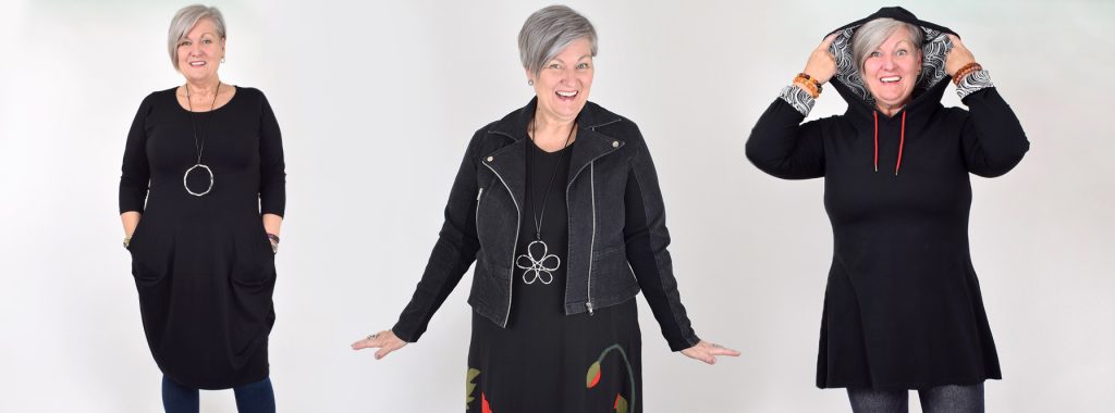
BLACK – a strong color that can be perceived as scary
How the color is perceived and how it affects you:
- Timeless, luxurious and strong
- Mystical and moody and sometimes rebellious and aggressive
- A common color in the fashion industry since people are of the opinion that it makes you look thinner
- Can give the impression of you being an introvert and want to keep people at a distance
- Sometimes it can feel hard to open up to a person dressed in black
Good tip!
Black is a great color in case you want to play with contrasts (black and white, black and red). Stay clear from black if you do not have the time to take care of your clothes, since dust and dirt shows easily on black

BROWN – down to earth and safe
How the color is perceived and how it affects you:
- Down to earth, cozy and safe
- Nice and boring
- People open up more easily to a person dressed in brown


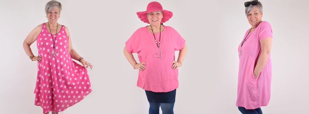
PINK – a peaceful color with that little extra
How the color is perceived and how it affects you:
- Feminine and/or childish, soft, playful and careful
- Calms and does not feel threatening, that is why it is sometimes used in prisons
Good tip!
Pink details in an outfit gives it that little extra. Try combining it with army green!

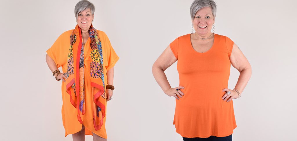
ORANGE – lively and stimulating
How the color is perceived and how it affects you:
- Has similar effects as the color yellow
- Viable, fun and warm
- Festive and happy
- Gives energy and increases appetite
- A common color in fast food restaurants
- Is often used in marketing since it increases the feeling of need
Good tip!
Try combining it with blue tones, such as indigo or why not try red?

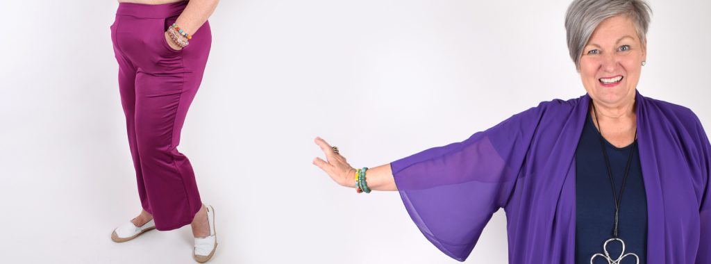
PURPLE – the color of fantasy and spirituality
How the color is perceived and how it affects you:
- A luxurious and spiritual color, that used to be associated with being sophisticated
- Boosts the brain and intellection
- Sparks the imagination
- Personal, emotional and unusual
Good tip!
Purple fits perfectly in the office where the thoughts should be flowing. Try combining it with orange and yellow!

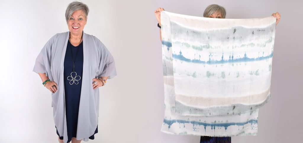
GREY – stabile
How the color is perceived and how it affects you:
- Neutral, balanced, insecure and careful
- Can seem old and boring
- Gives a professional impression
Good tip!
Try combining it with red, purple or pink!
There is no right or wrong color! Listen to your feelings – if a color makes you feel good that is the color you should wear! All colors fit everyone – you just have to find the right nuance and strength.
Are you adventurous and like to try new colors or do you prefer to use colors you feel comfortable in? Black, dark blue and grey are colors many people feel comfortable in. I still want to encourage you to fearlessly try to experiment with color!